When to Break Composition Rules (And Why Rules Are Just Guidelines)
Four posts into this module, you now have a genuine toolkit: the rule of thirds, leading lines, framing, symmetry, negative space, and layered depth. This post exists to say something important before we move on: none of these are laws. They're the most reliable starting points for a beginner learning to see a frame differently — but working photographers break every single one of them constantly, on purpose, when the shot calls for it.

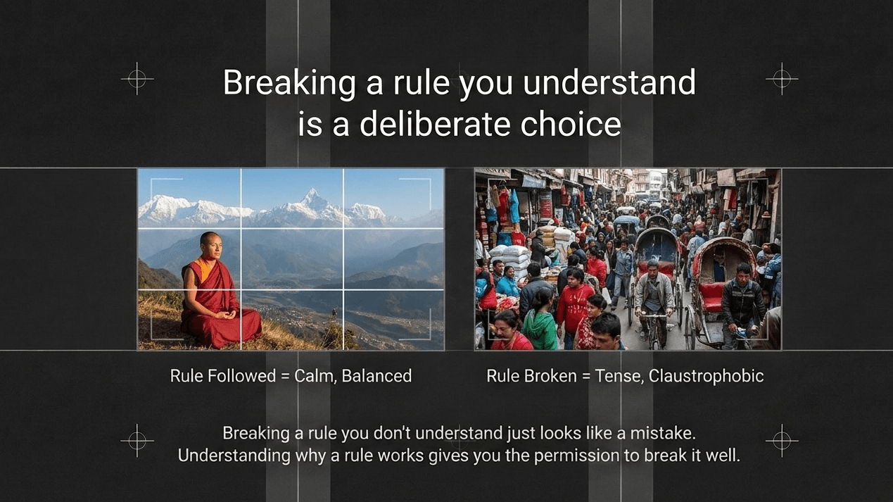
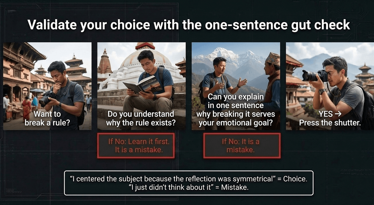
Understanding why a rule works is what actually gives you permission to break it well. Breaking a rule you don't understand just looks like a mistake. Breaking a rule you understand looks like a choice.
Why rules exist in the first place
Every composition technique in this module works because it taps into something predictable about how human vision processes an image — the eye follows lines, gravitates toward power points, reads balance in symmetry, and reads meaning into empty space. These aren't arbitrary conventions; they're observations about visual perception that happen to hold true often enough to teach as reliable defaults.
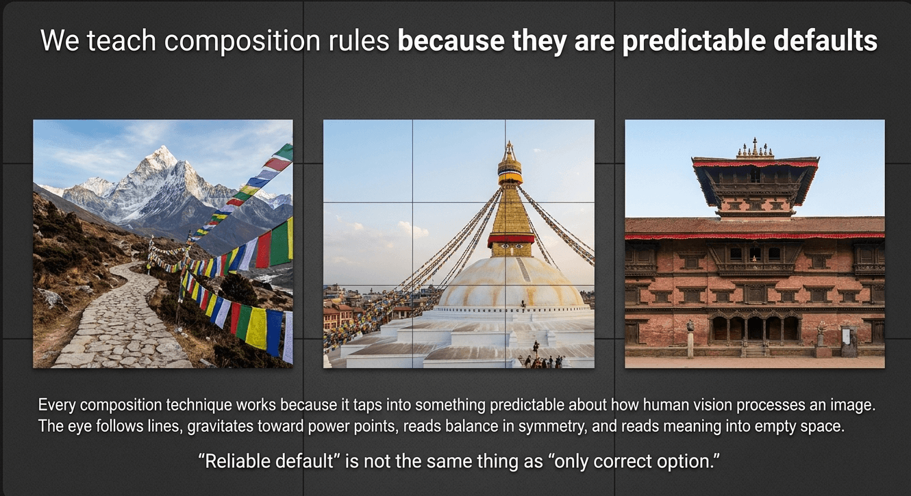
But "reliable default" isn't the same as "only correct option." Once you understand why the rule of thirds usually creates a balanced, pleasing composition, you can also understand exactly when balance isn't what a photo needs.
When breaking the rule of thirds works: intentional tension
Centering a subject dead-on, or pushing it right up against the edge of the frame, can create discomfort, intensity, or claustrophobia that a balanced, off-center composition simply can't produce. This is a deliberate emotional choice, not an accident.
Example — a documentary-style portrait of a craftsman in a cramped Patan metalworking shop:

Framing him tightly, off-balance, with his tools crowding the edges of the frame and barely any breathing room, communicates the physical closeness and intensity of his workspace far more honestly than a calm, centered, rule-of-thirds portrait would. The "poor" composition, by conventional standards, is exactly what makes the photo feel true to the space.
When breaking symmetry works: introducing imperfection deliberately
We covered symmetry as a strong choice for naturally balanced scenes in an earlier post. But sometimes introducing a single, deliberate break in an otherwise symmetrical scene creates more visual interest than perfect symmetry alone.
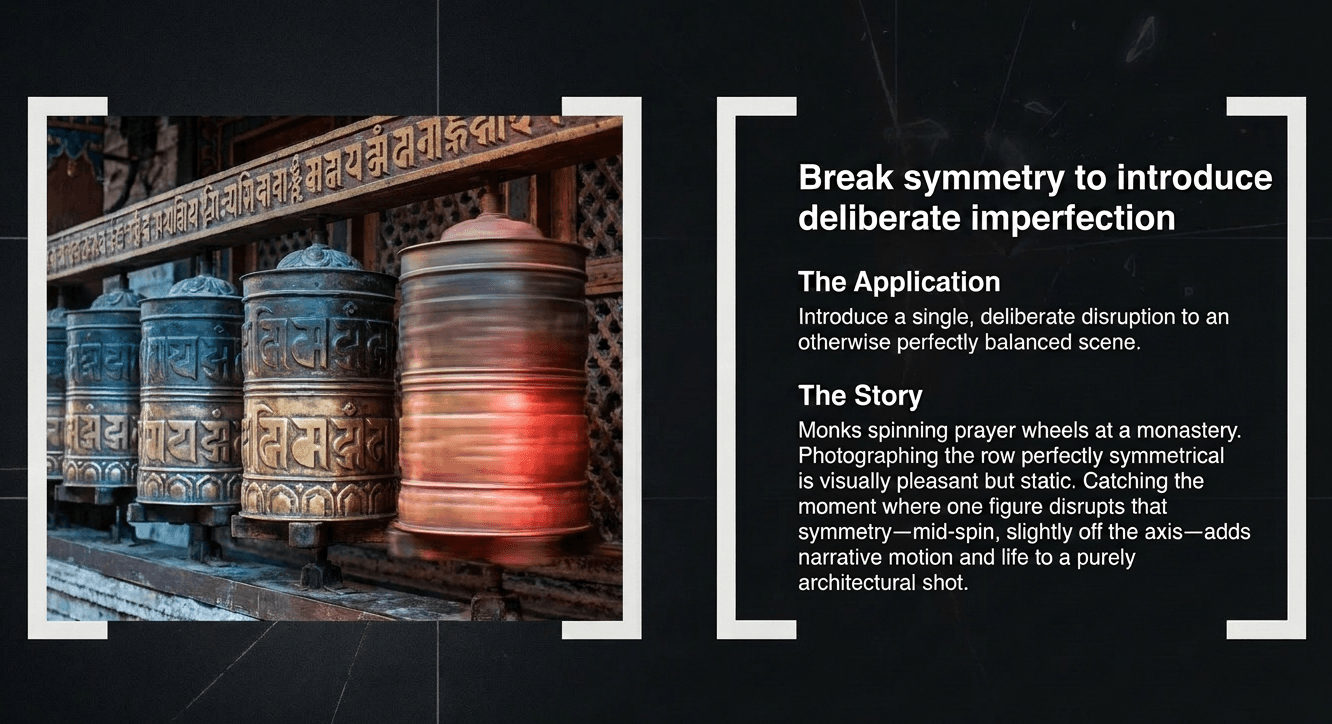
Example — a row of prayer wheels at a monastery, with one monk mid-motion spinning a single wheel: Photographing the row perfectly symmetrical and static would be visually pleasant but static. Catching the moment where one figure disrupts that symmetry — mid-spin, slightly off the axis — adds narrative motion and life to what would otherwise be a purely decorative, architectural shot.
When breaking negative space rules works: intentional claustrophobia or chaos
We covered negative space as a way to give a subject visual weight through emptiness. The opposite — filling a frame edge-to-edge with no breathing room at all — can be exactly the right choice when the subject itself is about density, crowding, or chaos.
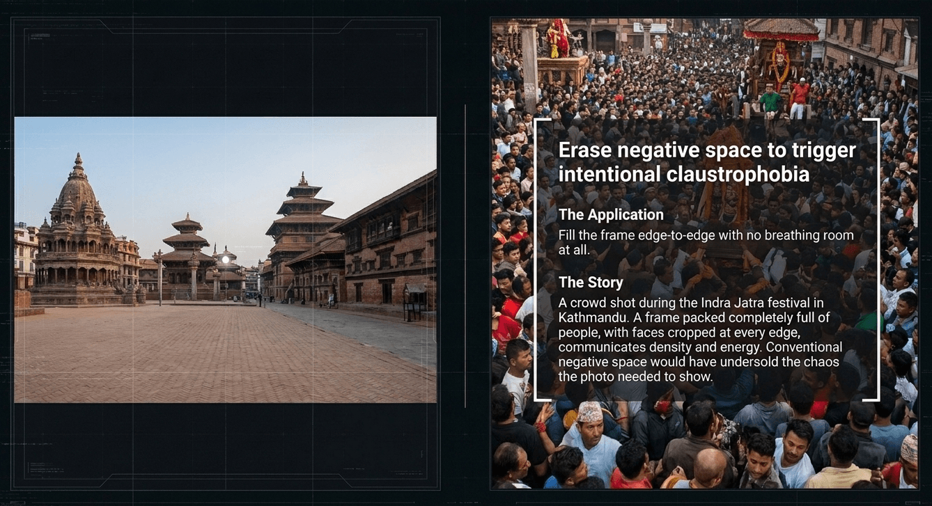
Example — a crowd shot during Indra Jatra festival in Kathmandu: A frame packed completely full of people, with no negative space anywhere and faces cropped at every edge, actually communicates the density and energy of the festival crowd more effectively than a composition with breathing room would. Negative space would have undersold exactly what the photo needed to show.
When breaking the leading lines rule works: ambiguity and disorientation
Leading lines are meant to guide the eye clearly toward a subject. Sometimes photographers deliberately introduce conflicting or converging lines that pull the eye in multiple directions at once, creating a sense of disorientation or visual complexity that a single clean line wouldn't achieve.
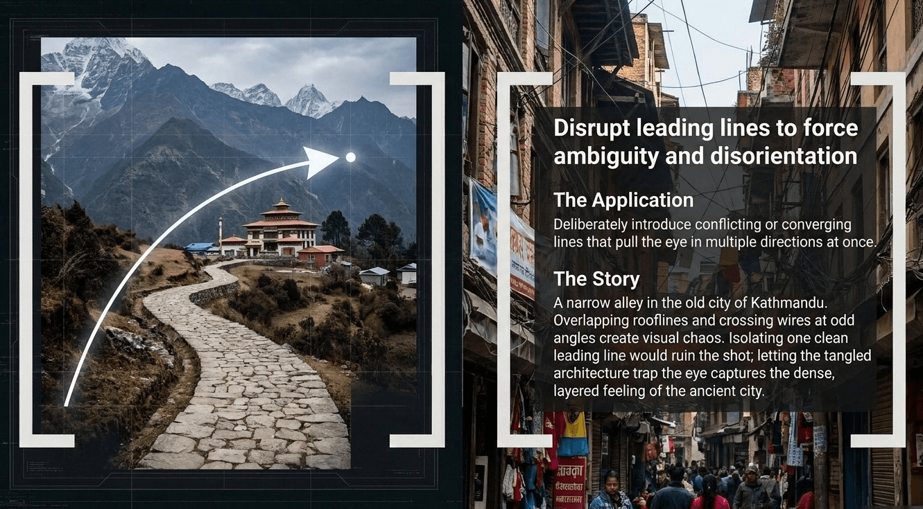
Example — a narrow alley in the old city of Kathmandu, shot with multiple overlapping rooflines and wires crossing the frame at odd angles: Rather than isolating one clean leading line, letting the visual chaos of overlapping architecture fill the frame can communicate the dense, layered feeling of the old city far better than a single, clean, guided composition would.
The actual rule for breaking rules
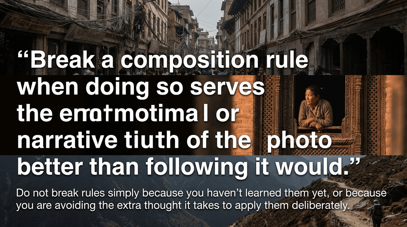
Here's the honest guideline we teach at Zyamaru: break a composition rule when doing so serves the emotional or narrative truth of the photo better than following it would — not simply because you haven't learned the rule yet, or because you're avoiding the extra thought it takes to apply it deliberately.
A useful gut check: could you explain, in one sentence, why breaking the rule made this specific photo stronger? "I centered the subject because the reflection was symmetrical" is a real, defensible reason. "I just didn't think about it" isn't.
Why learning the rules first still matters
It's tempting for a beginner to hear "rules are made to be broken" and skip straight to ignoring them. This genuinely doesn't work as well as it sounds. The photographers who break composition rules most effectively are the ones who've spent enough time deliberately applying them that breaking one is a conscious, felt choice — not a default they never learned to move past. This is exactly why this module placed rule-breaking as the fifth post, not the first.
A practice drill: break one rule on purpose
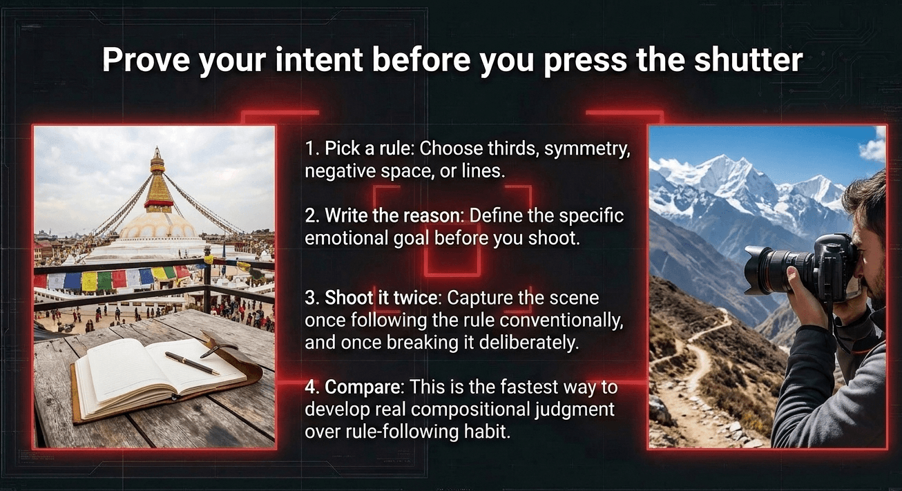
Pick any technique from this module — rule of thirds, symmetry, negative space, leading lines — and deliberately shoot a scene breaking it, with a specific reason in mind before you press the shutter. Write that reason down beforehand. Compare the result to a version of the same scene shot following the rule conventionally. This is genuinely one of the fastest ways to develop real compositional judgment, rather than just rule-following habit.
What comes next in this module

- Perspective & Angles — how camera height changes the entire story of a photo, the final post in Module 3 before we move into Module 4: Understanding Light
Develop compositional judgment hands-on at Zyamaru Films Academy

Knowing when a "broken" composition is a deliberate creative choice versus simply a weak photo is a genuinely advanced skill, and it's exactly the kind of judgment our instructors help students build through direct, honest feedback on real shoots. Our Basic Photography to Cinematography course at Zyamaru Films Academy in Tahachal, Kathmandu is built around this kind of hands-on critique, guided by an industry-active cinematographer.
Turn Passion Into Profession.
Frequently asked questions
Is it okay for beginners to break composition rules?
Yes, but it's most effective once you understand why the rule works in the first place. Breaking a rule deliberately, for a clear reason, reads as a creative choice — breaking it without understanding it usually just reads as a mistake.
What's an example of a photo that's stronger because it breaks the rule of thirds?
A perfectly symmetrical reflection, or a tightly cropped, off-balance documentary portrait meant to convey intensity or closeness, are both situations where centering the subject or ignoring standard balance produces a stronger result than a conventional rule-of-thirds composition.
How do I know if breaking a rule made my photo better or worse?
A useful test is whether you can explain, in one clear sentence, why breaking the rule served the photo's emotional or narrative goal. If the reasoning is genuine and specific, it's likely a deliberate creative choice rather than an oversight.